Many cities have Open Data pages. But once you download the data, what can you do with it? This is my second blog post where I download several datasets from Cary, NC's open data page, and and give you a few ideas to get you started on your own data exploration!
And what data did I choose this time? Here's a picture from my friend Beth, to give you a hint. That would be a pretty nice fire to sit around on a crisp fall/winter evening, eh?!?

The Data
If you guessed "fire incident data" you are correct! Not a nice controlled fire like the one in the picture above - but one you have to call the fire department to come extinguish ...
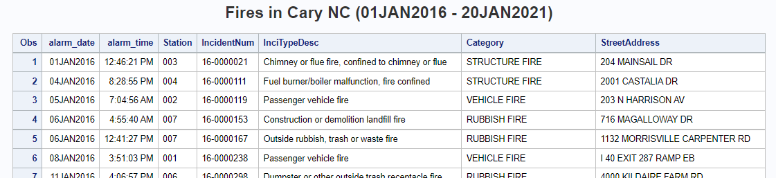
I downloaded the csv version of the Cary fire incident data from this page, and then used Proc Import to read it into SAS. After running Proc Import, I saved the generated code to speed up future runs (the first time you run the proc, it has to analyze each field of each line in the file, to determine what length and type to make each variable). See link to my SAS code, at the bottom of the blog.
Fire departments respond to several different kinds of emergencies - not just fires. For this particular analysis I only wanted to see the data specifically related to fires, therefore I subset the data to only include incidents where majorcategory='FIRE'. Here's a glimpse of what the data looks like in my SAS table:
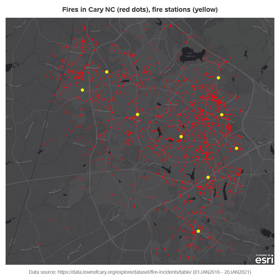
In addition to the fire incident data, I knew that I also wanted to include the locations of the fire stations in some of my analyses. Therefore I found a list of Cary's fire stations, copy-n-pasted their street addresses into a data step in my SAS code, and then used Proc Geocode to estimate the latitude/longitude coordinates for those addresses.
proc geocode data=station_data out=station_data (rename=(x=station_long y=station_lat))
method=street lookupstreet=sashelp.geoexm;
run;
Analysis based on geography
The first question that came to mind about this data is "where did the fires occur?" The incident data contains lat/long coordinates of each fire, therefore I didn't have to run Proc Geocode on the street address. I plotted the fire as red dots, and the fire stations as larger yellow dots. I chose a dark/grayscale background map, so that my marker colors would not be confused with any of the other map details (like it might be in a typical color OpenStreetmap).
proc sgmap plotdata=all_data noautolegend;
esrimap url="http://services.arcgisonline.com/arcgis/rest/services/Canvas/World_Dark_Gray_Base";
scatter x=incident_long y=incident_lat / markerattrs=(symbol=circlefilled size=3pt color="red");
scatter x=station_long y=station_lat / markerattrs=(symbol=circlefilled size=8pt color="yellow");
run;
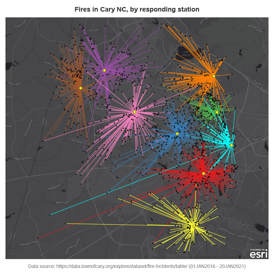
The above map certainly helped make the data more approachable. But it also made me curious - which station responded to each fire? Is there a way to represent that on the map? I tweaked my code a little, and added a line from each fire incident to the station that responded. I also used a different color for each station's fires, to make it easier to visually group them. Pretty neat, eh - almost artistic!
Analysis based on month
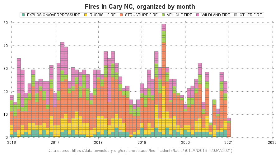
The next question that came to mind was whether or not there are more fires during certain times of the year? Therefore I created a special bar chart where the height of the bar represents how many fires that happened each month. I also used colors so you could see the types of fires.
A normal bar chart groups all of each color together into a bar segment, but I wanted each fire to be represented by a separate bar segment (square). Therefore I'm actually using a SGplot 'heatmap' rather than a bar chart. It took a little extra work (calculating an x/y coordinate for each square), but I think it was worth it! Looks like the month with the most fires was July 2019, and the month with the fewest was August 2020 (note that the last month in the graph is incomplete, because the data only goes through the 20th of that month).
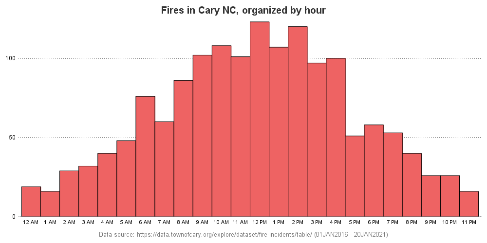
Analysis based on time
In addition to the geographical, and month-of-year analyses (above), I thought it might be interesting to see if there were any trends by time-of-day. Therefore I created a histogram, showing the number of incidents by hour. I rounded each time to the nearest hour, and the height of the bar represents the number of fire incidents that happened during that hour.
What's Next
Do you see any trends in the data? Were they trends you expected to see, or did any of them surprise you? What other analyses might provide more insight into this data? Here's a link to my SAS code, in case you would like to experiment with it, and maybe modify it to plot your city's open data.
Also, here's a link to the interactive version of the charts, with mouse-over text for all the markers on the maps, etc.

5 Comments
Hi Robert, I especially like your bar chart organized by month. See from the code that you created this by using a Heat map. That was a really cool idea. It would be nice to have a more elaborate guide/tutorial for this kind of graphs. I also seem to recall that you have made similar types of graphs using map techniques earlier. Would be nice with a series that would make it easier to use these techniques.
The organized by month chart you have made here was to me so pleasing so maybe a more direct way of making these kind of charts would be good in sgplot.
Thanks Pål - glad you liked that special variation of a bar chart!
Perhaps I'll make that type of chart the focus of a future blog. 🙂
Yes I liked and I have a couple of use cases where it will be really good for understanding the data.
Really great visualizations - especially the fires by responding stations.
Thanks! - That's my favorite too.